HP Sprocket
A Blueprint for Better Printing
overview
Purpose and introduction
I own a HP Sprocket - a small, portable, photo printer. It was a gift that was supposed to spark creativity. Instead, it collects dust.
As a designer, it’s sad that this tool is held hostage by its own software. I stopped using a product I loved, since its software didn't love me back.
process
Problem
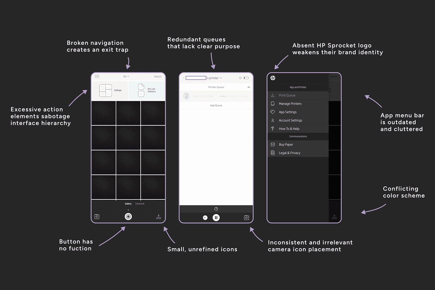
The HP Sprocket app suffers from broken components and a weak visual hierarchy. Visually, the experience feels unrefined and disappointing.
Confusing navigation frustrates potential users. The app is clunky and unreliable, and worst of all: it’s required.
Challenge and Iteration
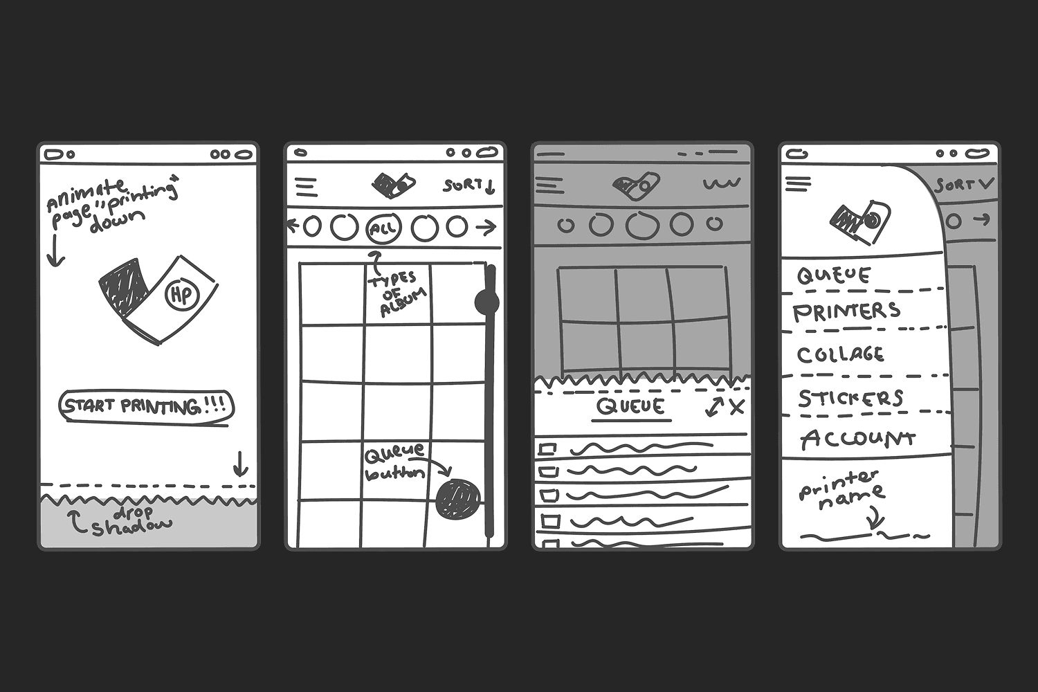
The challenge of this project was harmonizing creativity and functionality. Constant trial and error became my second language!
Strategic Decisions
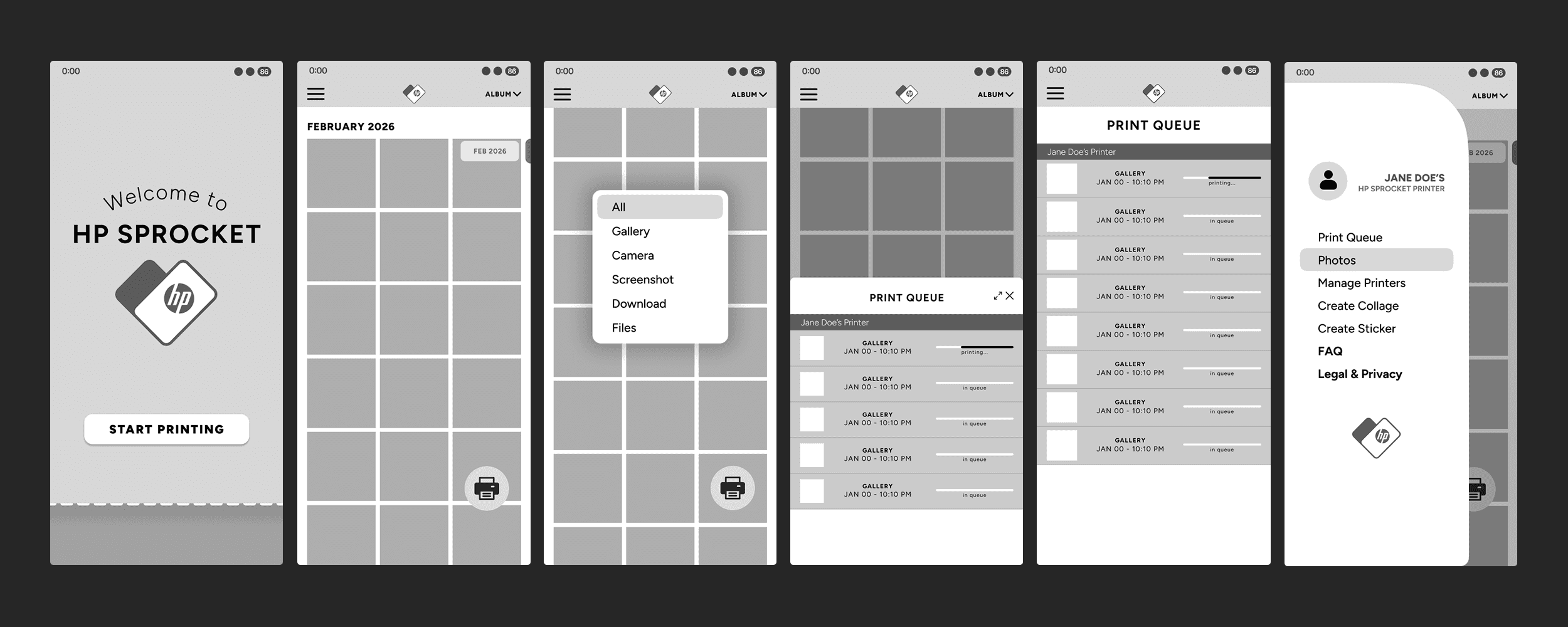
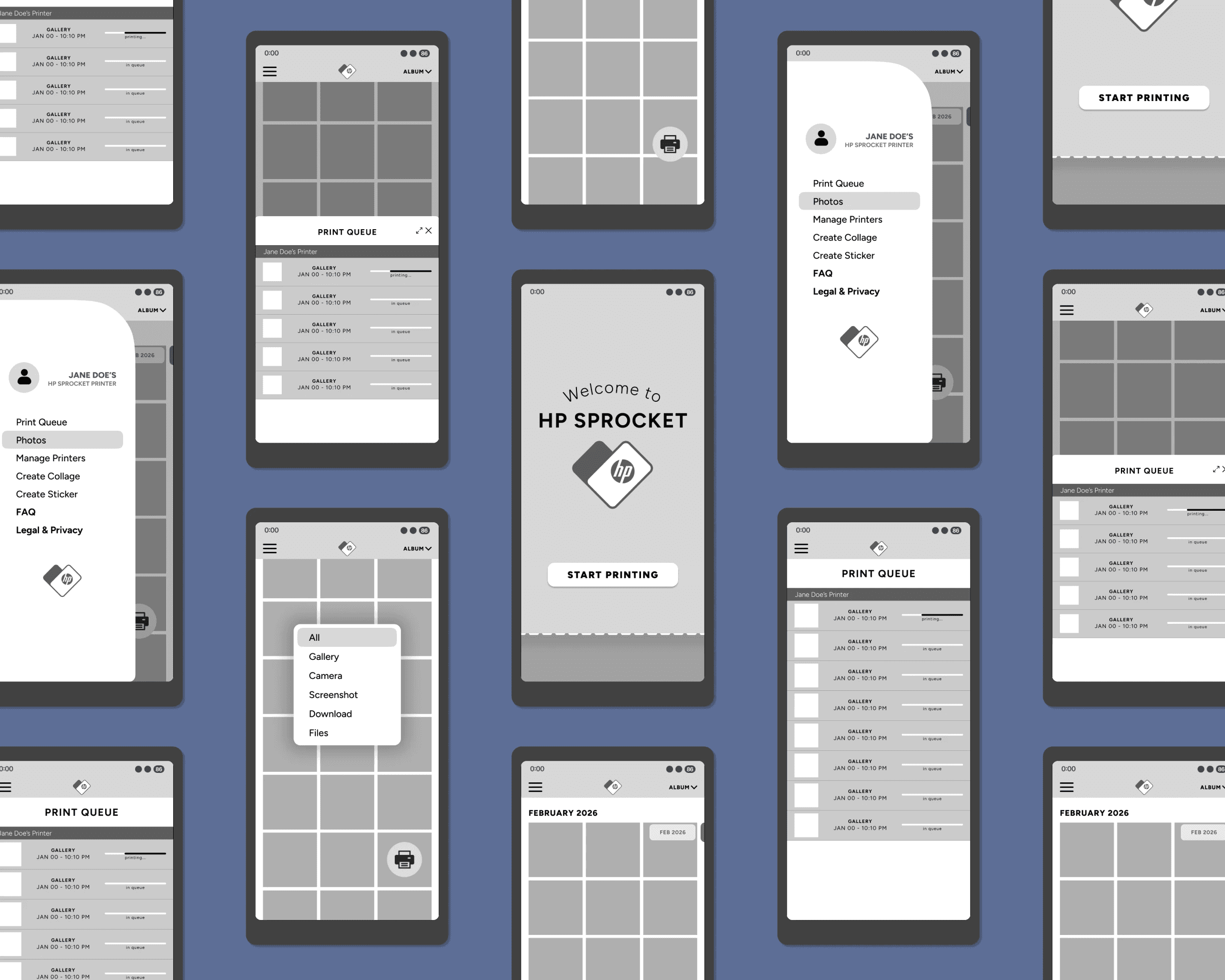
I initially explored ideas full of personality and expression, such as an interactive album navigation and fun designs like the “paper” edges. While I loved its character, I pivoted toward a minimalist layout for the sake of correct hierarchy and a modern theme.
Refining these concepts required many rounds of iteration before moving into high-fidelity wireframes. Though it was tiring, I learned something with every new iteration.
results
Growth and Insights
Redesigning the HP Sprocket app taught me that high-fidelity wireframing is essential for UX testing. I streamlined user navigation by relocating distracting components from the interface.
My redesign was centered on an ideal path: quick entry > easy album selection > clear print status.
What I Learned
Ultimately, I learned how much a poor interface directly damages brand status and user retention. Even after purchasing a product, users will still walk away after a frustrating experience.
Great design is the key to keeping customers connected to a brand. The journey of this project was every bit as rewarding as getting it finished.
My own frustration inspired this project.